Designing and Working with Single View States on Android
2020-05-25 • Márton Braun
Introduction
Using a single ViewState object to represent the state of a screen in an Android application is fairly popular these days. Some presentation layer architectures enforce this explicitly (see MVI, for example), while others have this as an option (MVVM).
A setup like this will have a basic rule:
The state object should have a one-to-one mapping to the UI state.
In this article, we’ll look at some basic patterns you might end up using if you decide to go this way with your View architecture.
As always when discussing architecture, this warrants a small disclaimer: this isn’t an ultimate solution for every app and every screen.
The code shown in this article is available in this repository.
Design approaches
There are two major approaches for designing ViewState objects for this scenario:
- A single data class.
- A hierarchy of sealed classes.
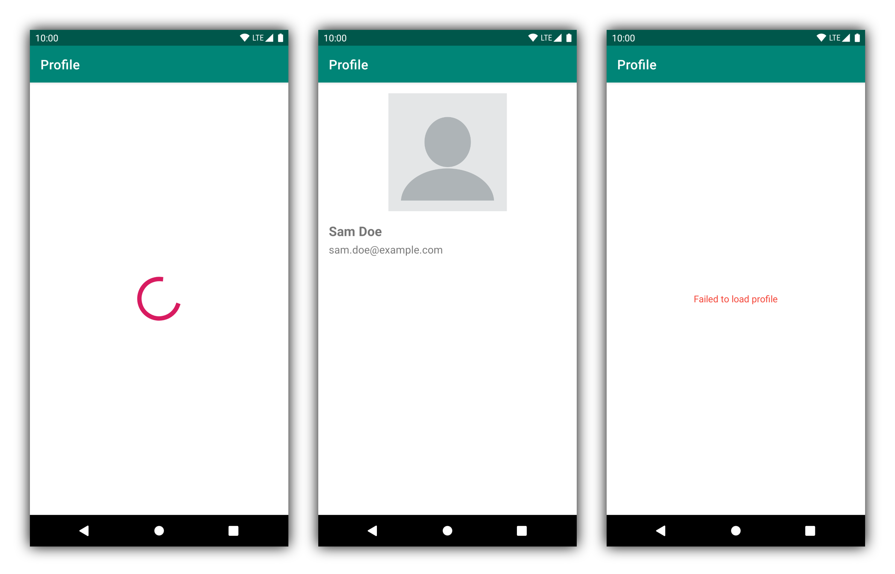
A single data class is the simpler way to go, as you can just put all the things the screen might display into it. For example, take a screen that can show a loading indicator, a user’s profile information, or a network error:
Here, we might come up with a data class like this to represent the state:
data class ProfileViewState(
        val errored: Boolean = false,
        val loading: Boolean = false,
        val name: String? = null,
        val email: String? = null
)
The expectation here is that while the profile data is being loaded, loading is true, errored would be false, and the pieces of profile information would be null. When the profile is ready, the name and email properties would have non-null values, and errored and loading would be false. However, none of this is enforced by the design of the class.
It’s possible to create instances of the ViewState object that don’t make much sense for us:
ProfileViewState(errored = true, loading = true, name = "Sally")
Should we still be showing a loading indicator here, with the name already available? Should we show an error message on the profile somehow? Can we show the name of the user, without an email address? It’s hard to tell what should happen on the UI when this state is observed by the View.
In situations like this, when our ViewStates are mutually exclusive - we’ll only ever want to show one of them at a time - sealed classes can give us a much better model.
This isn’t to say that data classes will be completely discarded - on the contrary. But we’ll get back to them a bit later.
Sealed classes for distinct states
In the example above, we had three states: error, loading, and a state where our data is ready, which is often called content.
You might have multiple different “content” type states, or no error state, or other deviations from this basic pattern. The ideas used, however, remain the same in these cases, as long as the states are mutually exclusive.
Using a sealed class, we can make each of these states a possible implementation of ProfileViewState:
sealed class ProfileViewState

object Loading : ProfileViewState()

object Error : ProfileViewState()

data class ProfileLoaded(
    val name: String,
    val email: String
) : ProfileViewState()
The great advantage of sealed classes is that each of the implementations of the sealed class is a full-fledged class on its own. This means that they can each have their own sets of properties, independently of each other.
In this example, two of our cases have no parameters at all, so they are implemented as an object, to avoid having to create new instances of them. The content state that holds some values is implemented as a data class, to make it easily comparable to other ViewState instances. This is useful if your mechanism for updating ViewState doesn’t dispatch the same ViewState twice in a row (as in that case, the UI should already be in the desired state, and doesn’t need an update).
Now, when we receive a ViewState value to be displayed on the UI, we can check its concrete type, and display the appropriate state:
private fun render(viewState: ProfileViewState) {
    when (viewState) {
        Loading -> {
            viewFlipper.displayedChild = Flipper.LOADING
        }
        Error -> {
            viewFlipper.displayedChild = Flipper.ERROR
        }
        is ProfileLoaded -> {
            viewFlipper.displayedChild = Flipper.CONTENT
            profileNameText.text = viewState.name
            profileEmailText.text = viewState.email
        }
    }.exhaustive
}
Within each branch here, the viewState variable will be smart cast to the concrete ViewState implementation type. This is why we can access the name and email properties in the last branch easily.
Now, let’s break down the implementation of this render method.
Being exhaustive
First, note the use of the exhaustive extension property here. when only forces us to handle every possible case (every type of ViewState from our sealed class, in this example) when it’s used as an expression (when its return value is used somehow).
In this case, we are not returning anything from it, just performing logic inside the branches. Hence the use of this no-op property that makes when an expression:
inline val <T> T.exhaustive get() = this
This forces us to handle all possible states of the screen. If we were to add a new branch to the sealed class, our render method wouldn’t compile anymore.
There is a ticket on YouTrack discussing official language level support for an “exhaustive” or “sealed” when statement, so that this kind of workaround isn’t needed.
Exclusive visibility with ViewFlipper
It’s the responsibility of this kind of render method to update the state of the UI to reflect the current ViewState. It must be implemented in a way so that any previous ViewStates do not affect the current state of the UI. In other words, the same ViewState being set must always result in the same state for the Fragment’s UI, no matter what previous state it comes after.
This can be done manually, with careful management of View visibilities and attributes, which we’ll see later on. However, in this example, a ViewFlipper is used to ensure that only the parts of the screen’s layout that belong to a given state will be visible at a time. A ViewFlipper is a FrameLayout implementation with the special property that only one of its children is visible at any given time.
The child of the ViewFlipper to be displayed has to be set by index, which doesn’t lead to very readable code. One solution to avoid hardcoding Int values is to create constants for each index. These can go in the companion object, but remember that you can also nest other named objects inside a class:
class ProfileFragment : Fragment() {
    private object Flipper {
        const val LOADING = 0
        const val CONTENT = 1
        const val ERROR = 2
    }

    // ...
}
The layout for this screen will look something like this:
<ViewFlipper
    android:id="@+id/viewFlipper"
    android:layout_width="match_parent"
    android:layout_height="match_parent">

    <ProgressBar
        android:id="@+id/progressBar"
        android:layout_width="80dp"
        android:layout_height="80dp"
        android:layout_gravity="center" />

    <androidx.constraintlayout.widget.ConstraintLayout
        android:id="@+id/profileContent"
        android:layout_width="match_parent"
        android:layout_height="match_parent">
        <ImageView />
        <TextView />
        <TextView />
    </androidx.constraintlayout.widget.ConstraintLayout>

    <TextView
        android:id="@+id/profileError"
        android:layout_width="wrap_content"
        android:layout_height="wrap_content"
        android:layout_gravity="center"
        android:text="Failed to load profile" />

</ViewFlipper>
It’s a good idea to extract the children of ViewFlipper to their own separate layout XML files. The smaller files are easier to navigate and maintain, plus you’ll be able to preview each of them individually in Android Studio. When they’re nested in the ViewFlipper, only the first child is visible in the previews.
The main layout also becomes very simple:
<ViewFlipper
    android:id="@+id/viewFlipper"
    android:layout_width="match_parent"
    android:layout_height="match_parent">

    <include layout="@layout/profile_loading" />
    <include layout="@layout/profile_content" />
    <include layout="@layout/profile_error" />

</ViewFlipper>
Doing this kind of refactoring is fairly simple in Android Studio. Select the piece of layout you want to move to a separate file, and use the Extract | Layout action to quickly perform the refactoring.
Summary of using sealed classes
With this setup, the distinct states are clearly represented everywhere:
- In the ViewState object, as separate branches of the sealed class.
- In the View implementation (for example, the Fragment), as three branches of a
whenstatement that displays a given state, populating the screen with data. - In the layout files, each a separate XML layout.
Data classes for mixed states
Sealed classes are neat, but they only work if your states don’t share data. You can add the same properties to multiple implementations of the sealed class, but it’s not always a convenient way to manage state.
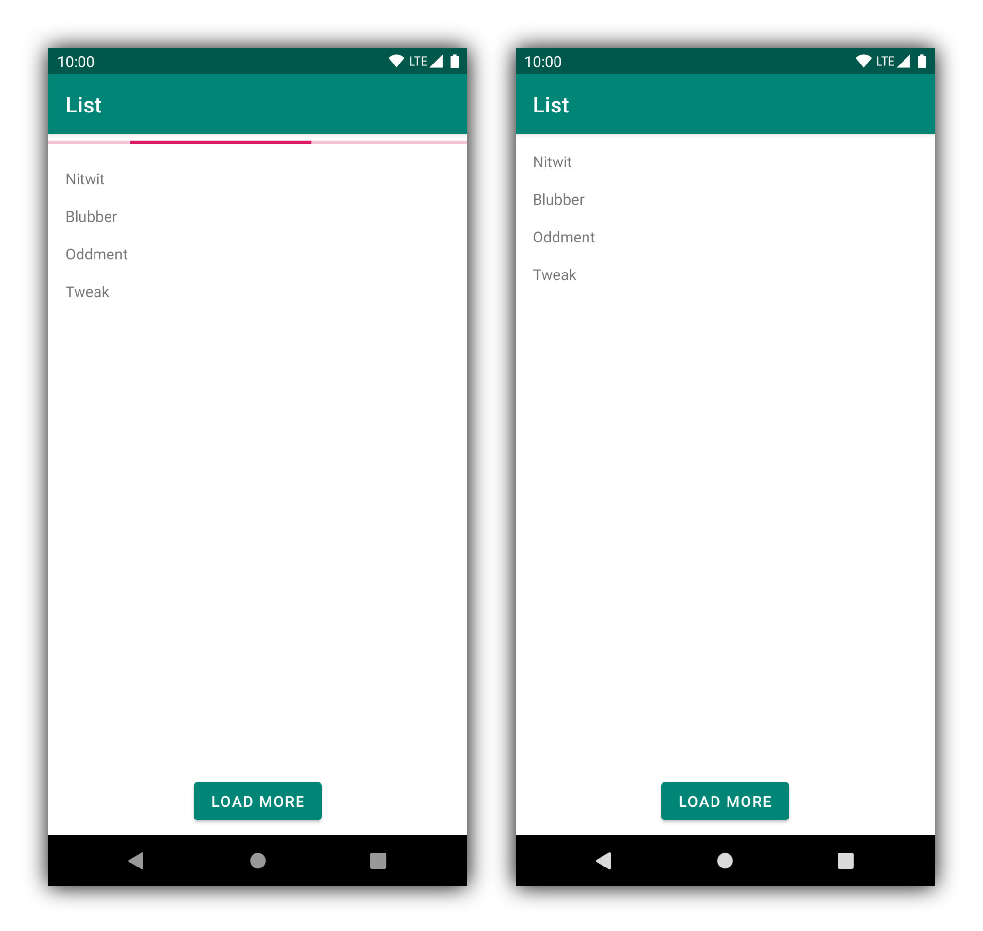
For example, let’s take a screen that displays a list of items (just words, for simplicity), and also has a loading state which is triggered sometimes, to load more items. The difference from the previous example here is that we want to both display a loading indicator and the already loaded items at the same time. The content and loading states don’t exist exclusively.
We can use just a regular data class to represent the ViewState for this:
data class ListViewState(
    val isLoading: Boolean,
    val items: List<String>
)
We don’t have the issue of being able to create nonsense states: isLoading can have any value regardless of what items we have (if any).
Rendering this state is a trivial task, using isVisible to update the visibility of our progress indicator, and a ListAdapter to back our RecyclerView:
private fun render(viewState: ListViewState) {
    progressBar.isVisible = viewState.isLoading
    wordAdapter.submitList(viewState.items)
}
Using the copy method that we get for our ViewState (since we made it a data class), we can make updates conveniently, like this:
fun loadMore() {
    viewModelScope.launch {
        state = state.copy(isLoading = true)

        val newWords = getMoreWords()

        state = state.copy(
            isLoading = false,
            items = state.items + newWords
        )
    }
}
It’s worth mentioning that this kind of mixed ViewState can always be combined with the sealed class approach within a single screen. If the loading and content states are not exclusive, but you have an error state that takes over the entire screen, you can always wrap this data class into a sealed class:
sealed class ListViewState

object Error: ListViewState()

data class ListReady(
    val isLoading: Boolean,
    val items: List<String>
): ListViewState()
For each level of your ViewState hierarchy, you can choose data classes or sealed classes depending on whether they’re exclusive or not.
A complex example
Finally, let’s take a look at a third screen, with more possible states, and UI elements that are shared between the states.
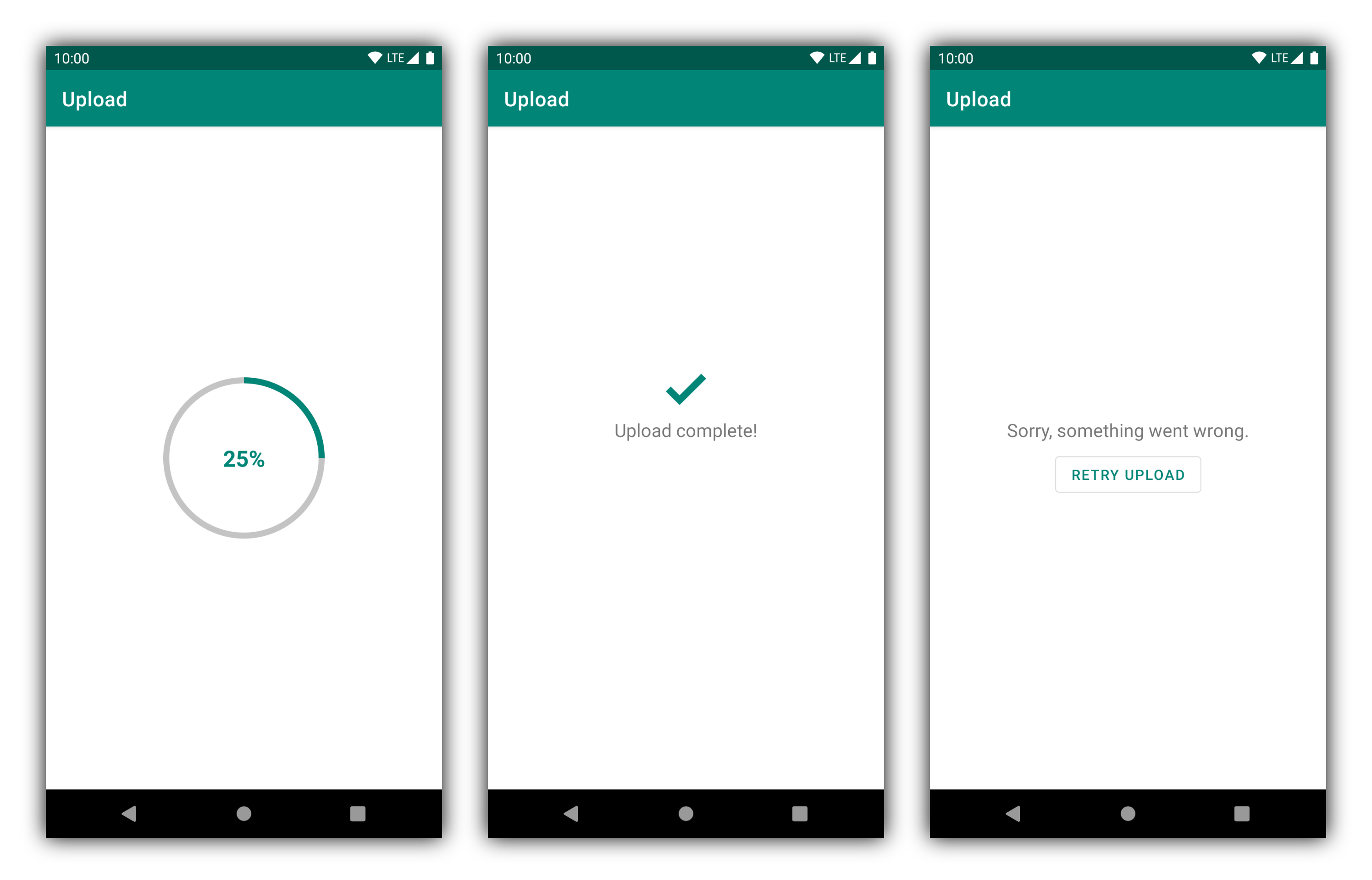
This example is an upload screen, which has an initial state when created, then it starts an upload and provides progress updates. The upload either completes successfully and displays a celebration message, or it fails and displays an error screen with a retry button.
The possible states can be represented neatly with a sealed class:
sealed class UploadViewState

object Initial : UploadViewState()

data class UploadInProgress(val percentage: Int) : UploadViewState()

object UploadFailed : UploadViewState()

object UploadSuccess : UploadViewState()
As mentioned before, we’ll have shared UI elements, namely, the failed and success states will display the same kind of status message, so these will reuse the same TextView for this purpose. Additionally, all the Views required for the states will be laid out in a single ConstraintLayout, to avoid nesting layouts.
Here’s a simplified view of the layout:
<androidx.constraintlayout.widget.ConstraintLayout>

    <MaterialToolbar
        android:id="@+id/toolbar" />
    <CircularProgressBar
        android:id="@+id/progressBar" />
    <TextView
        android:id="@+id/uploadProgressText" />
    <ImageView
        android:id="@+id/uploadDoneIcon" />
    <TextView
        android:id="@+id/uploadStatusText" />
    <MaterialButton
        android:id="@+id/retryUploadButton" />

</androidx.constraintlayout.widget.ConstraintLayout>
The challenge when rendering a ViewState in this kind of scenario becomes keeping the render method consistent. For every branch that handles a given case of the ViewState, visibilities and attributes of every single View in the layout have to be updated correctly. This leads to long, error-prone blocks of code:
private fun render(viewState: UploadViewState) {
    when (viewState) {
        Initial -> {
            uploadProgressText.isVisible = false
            progressBar.isVisible = false
            uploadDoneIcon.isVisible = false
            uploadStatusText.isVisible = false
            retryUploadButton.isVisible = false
        }
        is UploadInProgress -> {
            uploadProgressText.isVisible = true
            progressBar.isVisible = true
            uploadDoneIcon.isVisible = false
            uploadStatusText.isVisible = false
            retryUploadButton.isVisible = false
            progressBar.setProgressWithAnimation(viewState.percentage.toFloat())
            uploadProgressText.text = "${viewState.percentage}%"
        }
        UploadFailed -> {
            uploadProgressText.isVisible = false
            progressBar.isVisible = false
            uploadDoneIcon.isVisible = false
            uploadStatusText.isVisible = true
            uploadStatusText.text = "Sorry, something went wrong."
            retryUploadButton.isVisible = true
        }
        UploadSuccess -> {
            uploadProgressText.isVisible = false
            progressBar.isVisible = false
            uploadDoneIcon.isVisible = true
            uploadStatusText.isVisible = true
            uploadStatusText.text = "Upload complete!"
            retryUploadButton.isVisible = false
        }
    }.exhaustive
}
Perhaps this is where data binding should be considered - while I’m not personally a fan of it, it might be a good fit for this kind of screen.
There are improvements to be made using manual View management as well, though. For example, extracting all the visibility changes to the start of the render method greatly improves its readability and maintainability:
private fun render(viewState: UploadViewState) {
    uploadProgressText.isVisible = viewState is UploadInProgress
    progressBar.isVisible = viewState is UploadInProgress
    retryUploadButton.isVisible = viewState is UploadFailed
    uploadDoneIcon.isVisible = viewState is UploadSuccess
    uploadStatusText.isVisible =
        viewState is UploadFailed || viewState is UploadSuccess

    when (viewState) {
        Initial -> {
            // Empty
        }
        is UploadInProgress -> {
            progressBar.setProgressWithAnimation(viewState.percentage.toFloat())
            uploadProgressText.text = "${viewState.percentage.toInt()}%"
        }
        UploadFailed -> {
            uploadStatusText.text = "Sorry, something went wrong."
        }
        UploadSuccess -> {
            uploadStatusText.text = "Upload complete!"
        }
    }.exhaustive
}
Using ConstraintLayout Groups
If you have multiple elements in a ConstraintLayout that will change visibilities together, wrapping them in a Group is a handy solution.
A Group is a virtual layout within ConstraintLayout, which allows you to - well, group Views together, without nesting them in an actual layout. When the group’s visibility (or elevation!) changes, all of its referenced Views will change the same way.
This is what a Group looks like in the XML file:
<androidx.constraintlayout.widget.Group
    android:id="@+id/errorViews"
    android:layout_width="wrap_content"
    android:layout_height="wrap_content"
    app:constraint_referenced_ids="errorTitle, errorIcon, errorMessage" />
Wrap-up
That’s it for a look at describing the state of a screen with a single ViewState object. Hopefully you’ve picked up some techniques here that you can apply to your own projects.
Want to continue reading up on the topic? Take a look at Thoughts about State Handling on Android, the next article in this series.
If you want to take a look at the code used in this article in action, as a working demo app, you’ll find it in this repository.
Some improvement suggestions mentioned here are omitted from the project, but you can add them yourself as practice! 🙂
For more about what data classes do exactly, and when you perhaps shouldn’t use them, give Data classes aren’t (that) magical a read.
Finally, if want to learn more about sealed classes, this talk by Patrick Cousins from KotlinConf 2018 has more examples of how they can be used to represent state.
Thanks to @stewemetal for his review of this article!
You might also like...
Introducing 🌈RainbowCake
RainbowCake is an Android architecture framework, providing tools and guidance for building modern Android applications.
Thoughts about State Handling on Android
Handling the state of UI correctly is one of the prominent challenges of Android apps. Here are my subjective thoughts about some different approaches, which ones I tend to choose, and why.
Thoughts about Event Handling on Android
In MVVM-like view architectures, view state isn't enough to communicate from the ViewModel to the View. They have to be supplemented by some kind of events, which come with several challenges you should be aware of.
Fragment Lifecycles in the Age of Jetpack
Fragments have... Complicated lifecycles, to say the least. Let's take a look at these, and how they all fit into the world of Jetpack today, with LifecycleOwners, LiveData, and coroutines.