Pi Practice App in Compose
2021-04-18 • Márton Braun
This article was originally planned for 🥧 Pi Day, and it clearly ran more than a month late. However, it’s finally complete!
Concept
This project is once again one of my older projects revived with Jetpack Compose. A couple years ago, I wrote an app that lets you practice and learn the digits of pi - always a fun thing to spend your commute on.
I’m rather rusty now and down to knowing about ~60 digits. How high can you score in the app? Tweet at me @zsmb13!
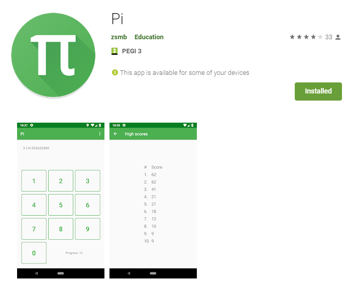
The app is still available in its original form on the Google Play Store for your pi practicing pleasure. Its sources are also available on GitHub.
If you take a look at the repository, you’ll find something rather interesting in its dependencies. It uses Anko Layouts to render some parts of its UI! This was an early, now deprecated and abandoned attempt by JetBrains to create declarative Android UI with Kotlin DSLs.
In this article, we’ll build the app in Compose, and also take a look at what some of the old Anko code looked like when we reach the relevant parts.
The completed app’s source code is available on GitHub, so you can browse it freely while reading the article.
Project setup, navigation
The app is rather simple, it consists of just two screens. The main screen contains the field displaying the current progress and the keypad to mash in the digits. The high scores screen displays the best runs you had at the digits of pi (a top 10 list of best attempts).
Navigation setup is simple in MainActivity:
setContent {
    PiPracticeComposeTheme {
        Surface(color = MaterialTheme.colors.background) {
            val navController = rememberNavController()
            NavHost(navController, startDestination = "home") {
                composable("home") {
                    Home(navController)
                }
                composable("highscores") {
                    HighScores(navController)
                }
            }
        }
    }
}
Main screen
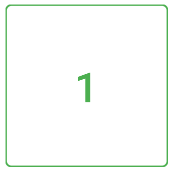
The first building block of the main screen will be a composable that displays a button, which can notify us when it was clicked. We’ll design this with a bottom-up approach.
@Composable
private fun NumberButton(
    number: Int,
    onClick: (Char) -> Unit,
    modifier: Modifier = Modifier,
) {
    OutlinedButton(
        onClick = {
            @OptIn(ExperimentalStdlibApi::class)
            onClick(number.digitToChar())
        },
        modifier = modifier
            .aspectRatio(1f)
            .padding(4.dp),
        border = ButtonDefaults.outlinedBorder.copy(
            brush = SolidColor(MaterialTheme.colors.primary)
        )
    ) {
        Text(
            text = number.toString(),
            fontSize = 30.sp,
            color = MaterialTheme.colors.primary,
        )
    }
}
This NumberButton uses basic Compose concepts, and is based on a material OutlinedButton. It takes a modifier as an optional parameter, following the relevant section of the Jetpack Compose API Guidelines by Google (a must-read if you’re writing Compose code).
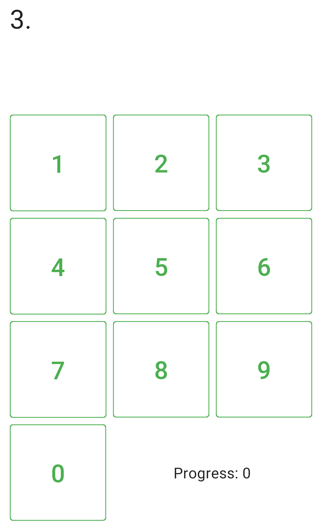
Keypad
The next step up is assembling a grid of these on the screen, adding a progress indicator in the bottom row, and adding the current value of pi that’s been entered in a field on the top of the keypad:
@Composable
private fun KeyPad(
    input: String,
    scrollState: ScrollState, // 1
    onClick: (digit: Char) -> Unit, // 2
) {
    val progress = input.length - 2
    Column(
        modifier = Modifier
            .fillMaxSize()
            .padding(8.dp)
    ) {
        Text(
            text = input,
            fontSize = 32.sp,
            modifier = Modifier
                .verticalScroll(scrollState) // 1
                .weight(1f)
                .padding(4.dp),
        )
        Row(Modifier.fillMaxWidth()) {
            NumberButton(number = 1, onClick, Modifier.weight(1f))
            NumberButton(number = 2, onClick, Modifier.weight(1f))
            NumberButton(number = 3, onClick, Modifier.weight(1f))
        }
        Row(Modifier.fillMaxWidth()) {
            NumberButton(number = 4, onClick, Modifier.weight(1f))
            NumberButton(number = 5, onClick, Modifier.weight(1f))
            NumberButton(number = 6, onClick, Modifier.weight(1f))
        }
        Row(Modifier.fillMaxWidth()) {
            NumberButton(number = 7, onClick, Modifier.weight(1f))
            NumberButton(number = 8, onClick, Modifier.weight(1f))
            NumberButton(number = 9, onClick, Modifier.weight(1f))
        }
        Row(Modifier.fillMaxWidth(), verticalAlignment = Alignment.CenterVertically) {
            NumberButton(number = 0, onClick, Modifier.weight(1f))
            Text( // 3
                text = stringResource(id = R.string.current_progress, progress),
                modifier = Modifier.weight(2f),
                textAlign = TextAlign.Center,
                fontSize = 18.sp,
            )
        }
    }
}
This code is a bit wordy, but it mostly just creates all the rows of buttons we’ll need, and aligns them using weight modifiers. Let’s review some of the other interesting bits:
- We’ll make the top
Textthat displays the current value of pi scrollable, as we’d eventually run out of space while practicing. This is easily done by using theverticalScrollmodifier. Note how the scroll state is hoisted to the containing function, which will let it control it externally. - All number button clicks are passed to the same
onClickevent listener. - We use the
stringResourcefunction to access Android string resources to make the few UI strings we have translatable.
This is what we built so far:
Game logic
Now it’s time to add the main game logic.
@Composable
private fun PiPad() {
val pi = stringResource(R.string.pi) // 1
val scope = rememberCoroutineScope()
// 2
var input by remember { mutableStateOf("3.") }
val scrollState = rememberScrollState()
// 3
var showDialog by remember { mutableStateOf(false) }
var lastInput by remember { mutableStateOf('-') }
fun reset() {
input = "3."
lastInput = '-'
showDialog = false
}
KeyPad(
input = input,
scrollState = scrollState,
onClick = { digit -> // 4
val indexToTest = input.length
val correctDigit = pi[indexToTest]
lastInput = digit
if (digit == correctDigit) {
// 5
input += digit.toString()
scope.launch {
delay(100)
scrollState.animateScrollTo(scrollState.maxValue)
}
} else {
// 6
val decimalReached = input.length - 2
ScoreKeeper.logScore(decimalReached)
showDialog = true
}
}
)
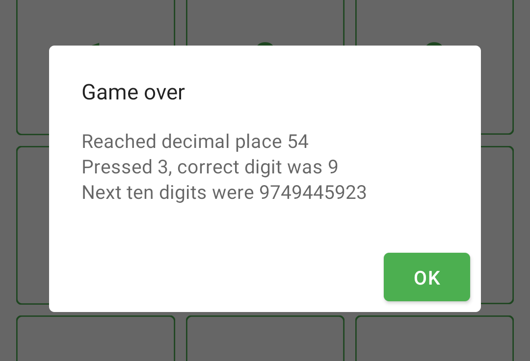
if (showDialog) {
val length = input.length
EndOfGameDialog(onDismiss = { reset() }) {
// 7
Column {
Text(stringResource(R.string.dialog_decimal_reached, length - 2))
Text(stringResource(R.string.dialog_digit_info, lastInput, pi[length]))
Text(stringResource(R.string.dialog_next_digits, pi.substring(length, length + 10)))
}
}
}
}
This is quite a bit of code, but most of it is simple, and it handles all of the game logic for us!
- The true value of pi comes from string resources.
- The current value that the player has progressed to is always in the
inputvariable. We also create the scroll state of the view that will display this value on the top of the screen here. - When the game ends, we’ll show a dialog. This requires us to remember the last input digit, and to keep track of whether we need to show the dialog or not.
- We instantiate a
KeyPad, and in itsonClicklistener, we implement all of the game logic. - If the player inputs the correct digit, we’ll add it to the
input, and make sure the view displaying it is scrolled to the bottom. - If the player makes an error, we log the score they reached, and then display the end-of-game dialog.
- The dialog’s content is passed in with the
contentlambda convention.
ScoreKeeperis a relatively boring Kotlin object that reads/writes a file to keep track of the high scores. You can check out its implementation in the GitHub repository.
Displaying a dialog
The EndOfGameDialog function used above is a wrapper around AlertDialog, implemented like so:
@Composable
private fun EndOfGameDialog(
    onDismiss: () -> Unit,
    content: @Composable () -> Unit,
) {
    AlertDialog(
        onDismissRequest = onDismiss,
        title = {
            Text(stringResource(R.string.dialog_game_over_title))
        },
        text = content,
        confirmButton = {
            Button(onClick = onDismiss) {
                Text(stringResource(R.string.dialog_ok))
            }
        },
    )
}
This dialog was one of the parts implemented with Anko in the original app, which looked like this - quite familiar and easy to read!
alert {
    customView {
        verticalLayout {
            padding = dip(24)

            textView {
                text = getString(R.string.decimal_reached, indexReached)
                textSize = 16f
            }
            textView {
                text = getString(R.string.digit_info, digit, correctDigit)
                textSize = 16f
            }
            textView {
                val nextDigit = indexReached + 1
                text = getString(R.string.next_digits, digitsToShow,
                        pi.substring(nextDigit, nextDigit + digitsToShow))
                textSize = 16f
            }
        }

        positiveButton(getString(R.string.OK)) { resetState() }
        onCancelled { resetState() }
    }
}.show()
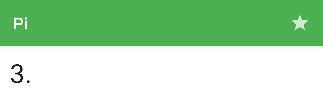
As the final touch for the main screen, we’ll add a toolbar on top to display the app name and provide navigation to the second screen.
@Composable
fun Home(navController: NavController) {
    Scaffold(topBar = {
        TopAppBar(
            title = { Text("Pi") },
            actions = {
                IconButton(onClick = { navController.navigate("highscores") }) {
                    Icon(
                        Icons.Default.Star,
                        stringResource(R.string.content_description_high_scores)
                    )
                }
            }
        )
    }) {
        PiPad()
    }
}
This now shows up on the top of our screen:
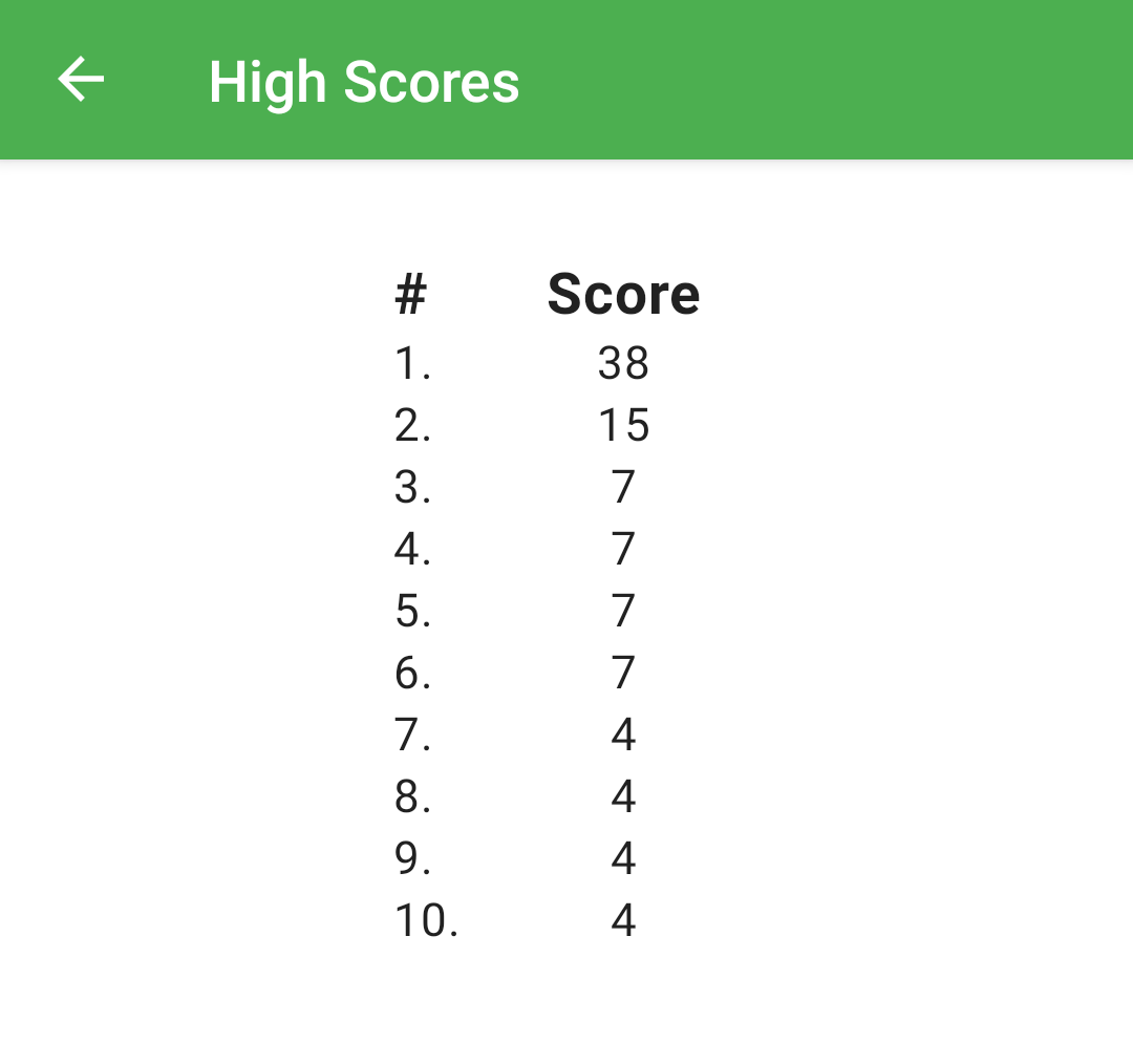
High scores
The high scores screen is extremely simple, it will display just a toolbar and a list of values. Before we see the Compose implementation, here’s the original Anko code for this screen:
verticalLayout {
    padding = dip(16)
    verticalGravity = Gravity.CENTER

    tableLayout {
        tableRow {
            horizontalGravity = Gravity.CENTER
            cell("# ") // 2
            cell(getString(R.string.Score)) // 2
        }

        ScoreKeeper.scores.forEachIndexed { index, score -> // 1
            tableRow {
                horizontalGravity = Gravity.CENTER
                cell("${index + 1}.") // 2
                cell(score.toString()) // 2
            }
        }
    }
}
- The rows of the table are created with a simple
forEachIndexedloop - a huge advantage and convenience of writing declarative layouts in Kotlin, having all the language features and constructs like the collection APIs available. - Each row here was assembled by calls to the
cellfunction, an extension I added on the receiver scope of the AnkotableRowfunction - the oddly named_TableRowtype.private fun _TableRow.cell(text: String) { textView(text) { padding = dip(4) textSize = 20f } }
The Compose syntax for this screen will yet again be very similar to the Anko based approach. We’ll set up a toolbar much like on the main screen, and then add a header and some items underneath in a loop.
@Composable
fun HighScores(navController: NavController) {
    Scaffold(
        topBar = {
            TopAppBar(
                title = { Text(stringResource(R.string.high_scores_title)) },
                navigationIcon = {
                    IconButton(onClick = { navController.popBackStack() }) {
                        Icon(Icons.Default.ArrowBack, null)
                    }
                },
            )
        }
    ) {
        Column(
            modifier = Modifier
                .fillMaxSize()
                .padding(32.dp),
            horizontalAlignment = Alignment.CenterHorizontally,
        ) {
            Header(Modifier.width(120.dp))

            ScoreKeeper.scores.forEachIndexed { index, score ->
                ScoreItem(index + 1, score, Modifier.width(120.dp))
            }
        }
    }
}
The Header and the ScoreItem composables are extremely similar, they’ll just use slightly different text styling. Here’s just the latter of them:
@Composable
private fun ScoreItem(
    index: Int,
    score: Int,
    modifier: Modifier = Modifier,
) {
    Row(modifier) {
        Text(
            text = "${index}.",
            textAlign = TextAlign.Start,
            modifier = Modifier.weight(1f),
        )
        Text(
            text = score.toString(),
            textAlign = TextAlign.Center,
            modifier = Modifier.weight(2f),
        )
    }
}
Ta-da, now we can display the high scores in the app:
Wrap-up
That’s it for now! Thanks for following along with another Compose article. You can find the completed project on GitHub to play around with it and see the rest of the code that I omitted from the article.
If you liked this project, you’ll also like these other ones:
You might also like...
Wrap-up 2021
Another year over, a new one's almost begun. Here's a brief summary of what I've done in this one.
Compose O'Clock
I started learning Jetpack Compose this week. Two days into that adventure, here's a quick look at how a neat clock design can be built up in Compose, step-by-step.
Prime Table Generator in Jetpack Compose
I've dusted off one of my oldest (and favourite) coding projects, and rewrote it in Jetpack Compose as a nice little practice exercise.
The conflation problem of testing StateFlows
StateFlow behaves as a state holder and a Flow of values at the same time. Due to conflation, a collector of a StateFlow might not receive all values that it holds over time. This article covers what that means for your tests.