Compose O'Clock
2021-03-02 • Márton Braun
I’ve seen this fancy clock on Reddit a few days ago. Seeing how I took this week to get started with Jetpack Compose, I figured it would be fun to attempt re-implementing that clock with our new Android UI toolkit.
A couple hours ago, I’ve seen that Aurimas Liutikas already created a Compose implementation of the same design, but I intentionally did not look at the source, as I really wanted to figure out how to do this myself.
Here’s what I came up with, just two days into learning Jetpack Compose, in about an hour’s worth of trial and error.
Let’s see how this can be built, step-by-step.
If you’re looking for the full code for this sample, it’s all available on GitHub.
A single digit
First, we’ll create a Number composable, which contains a Text with a fixed size. This takes a single parameter, the numerical value it should display.
@Composable
fun Number(value: Int) {
    Text(
        text = value.toString(),
        fontSize = 20.sp,
        modifier = Modifier.size(40.dp)
    )
}
Creating a @Preview with a Number in it lets us quickly check how this looks:
@Composable
@Preview
fun NumberPreview() {
    Number(3)
}
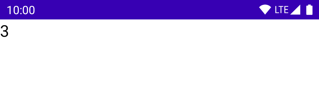
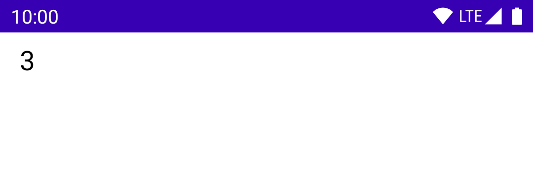
This renders the number in the upper left corner, but we wanted to center this Text within its 40dp by 40dp area. Setting textAlign on it would solve this horizontally, but I didn’t find anything similar for vertical alignment. Therefore, let’s just wrap it in a Box to achieve the alignment.
@Composable
fun Number(value: Int) {
    Box(
        contentAlignment = Alignment.Center,
        modifier = Modifier.size(40.dp),
    ) {
        Text(
            text = value.toString(),
            fontSize = 20.sp,
        )
    }
}
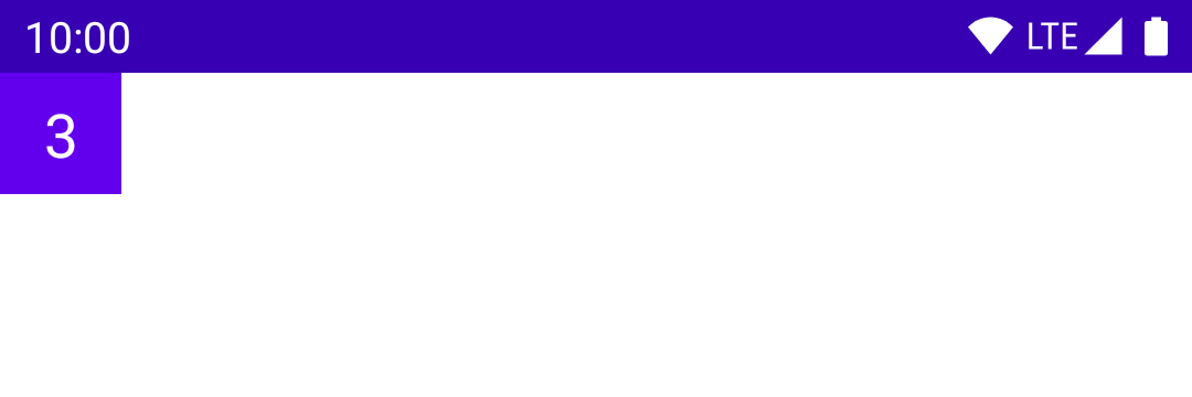
Continuing on, time to add some colour! The Box will provide a dark background colour, and the text will be white:
@Composable
fun Number(value: Int) {
    Box(
        contentAlignment = Alignment.Center,
        modifier = Modifier
            .size(40.dp)
            .background(MaterialTheme.colors.primary),
    ) {
        Text(
            text = value.toString(),
            fontSize = 20.sp,
            color = Color.White,
        )
    }
}
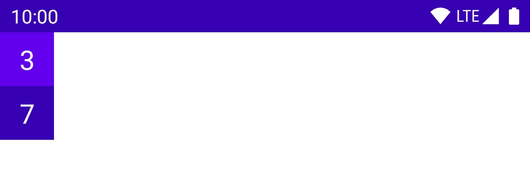
The currently selected number should have a different background colour within its column. This requires a new Boolean parameter in the composable, and then a simple if statement can decide which colour to use.
@Composable
fun Number(value: Int, active: Boolean) {
    val backgroundColor = if (active) {
        MaterialTheme.colors.primary
    } else {
        MaterialTheme.colors.primaryVariant
    }

    Box(
        contentAlignment = Alignment.Center,
        modifier = Modifier
            .size(40.dp)
            .background(backgroundColor),
    ) {
        Text(
            text = value.toString(),
            fontSize = 20.sp,
            color = Color.White,
        )
    }
}
Let’s also update the preview so that it shows one of each style of Number:
@Composable
@Preview
fun NumberPreview() {
    Column {
        Number(value = 3, active = true)
        Number(value = 7, active = false)
    }
}
A column of digits
That’s it for a single number! Now, to render a column of these, with a new NumberColumn composable. This takes a range of valid values, and the currently selected value as its parameters. A clip modifier gives us neat rounded corners, and creating each Number is as simple as iterating through the provided range.
@Composable
fun NumberColumn(
    range: IntRange,
    current: Int,
) {
    Column(
        Modifier.clip(RoundedCornerShape(percent = 25))
    ) {
        range.forEach { num ->
            Number(num, num == current)
        }
    }
}
Again, let’s see a quick preview:
@Composable
@Preview
fun NumberColumnPreview() {
    NumberColumn(range = 0..9, current = 5)
}
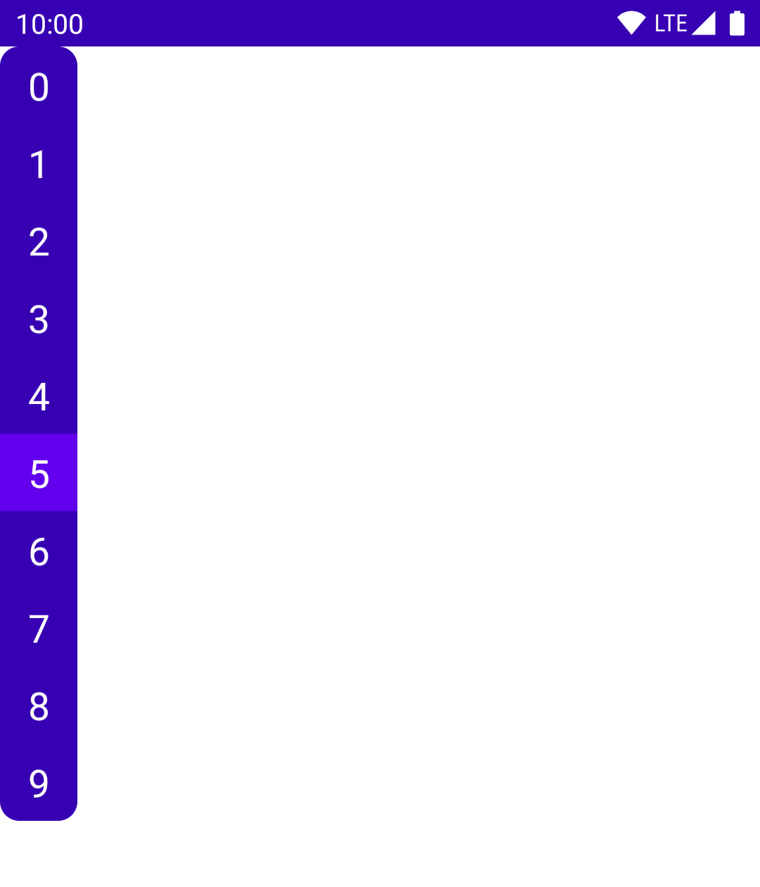
Looking good so far!
Creating a clock
Time to make this look and work like a clock. This requires six of these NumberColumns, each receiving a digit of the current time as its parameter. The time will be provided by a Time data class. The columns are arranged in a Row, which takes up the entire screen, and centers everything inside it both horizontally and vertically.
data class Time(val hours: Int, val minutes: Int, val seconds: Int)

@Composable
fun Clock(time: Time) {
    Row(
        modifier = Modifier.fillMaxSize(),
        horizontalArrangement = Arrangement.Center,
        verticalAlignment = Alignment.CenterVertically,
    ) {
        NumberColumn(0..2, time.hours / 10)
        NumberColumn(0..9, time.hours % 10)
        NumberColumn(0..5, time.minutes / 10)
        NumberColumn(0..9, time.minutes % 10)
        NumberColumn(0..5, time.seconds / 10)
        NumberColumn(0..9, time.seconds % 10)
    }
}
For now, we can display a static time in the preview:
@Composable
@Preview
fun ClockPreview() {
    Clock(Time(14, 15, 59))
}
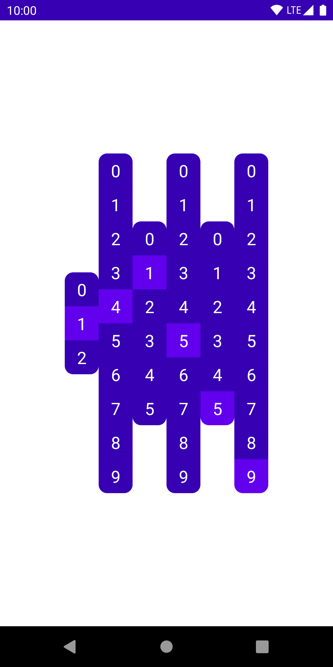
This displays the given time correctly, but we’re missing alignment of the active digits. We want to offset each column vertically, based on how far the current digit is from the middle of the column. If the current digit is in the middle, it requires no offsetting. If it’s at the end, we want to offset it by half the height of the column.
The math for this works out to be the distance of the current digit from the midpoint, times the height of each individual digit. The offset modifier gives us a very simple solution from here:
@Composable
fun NumberColumn(
    range: IntRange,
    current: Int,
) {
    val mid = (range.last - range.first) / 2f
    val offset = 40.dp * (mid - current)

    Column(
        Modifier
            .offset(y = offset)
            .clip(RoundedCornerShape(percent = 25))
    ) {
        range.forEach { num ->
            Number(num, num == current)
        }
    }
}
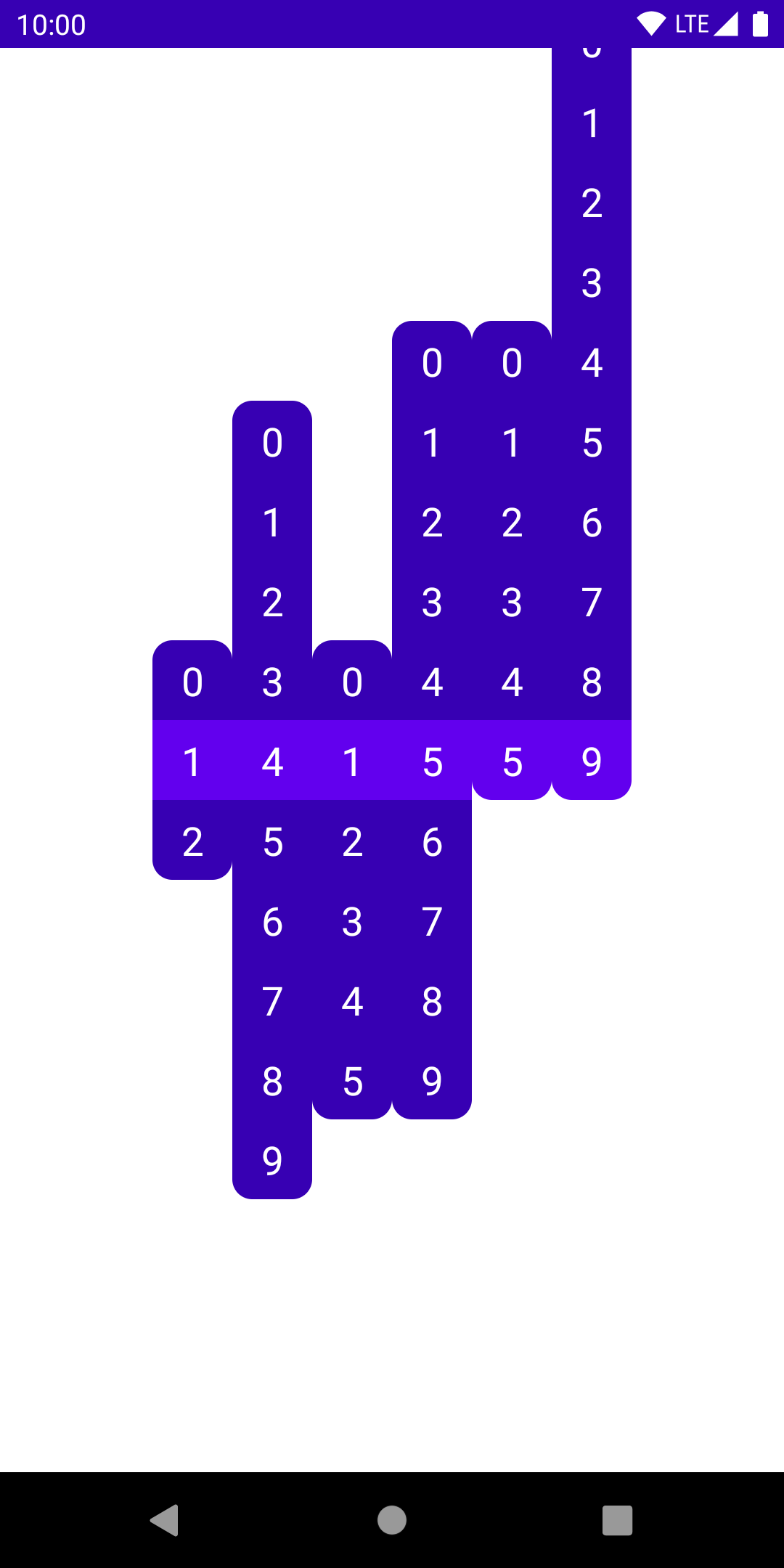
Now that we have the correct look, time to input the current time, and keep it updated.
@Composable
@Preview
fun ClockPreview() {
    fun currentTime(): Time { // 1
        val cal = Calendar.getInstance()
        return Time(
            hours = cal.get(Calendar.HOUR_OF_DAY),
            minutes = cal.get(Calendar.MINUTE),
            seconds = cal.get(Calendar.SECOND),
        )
    }

    var time by remember { mutableStateOf(currentTime()) } // 2
    LaunchedEffect(0) { // 3
        while (true) {
            time = currentTime()
            delay(1000)
        }
    }

    Clock(time)
}
Let’s see how this is done, step-by-step:
- The
currentTimefunction grabs aCalendarto get the current time, and creates one of ourTimeobjects, whichClockcan work with. - This line creates a piece of mutable state that Compose understands and can recompose when its value changes. This is initialized to the current time.
LaunchedEffectruns the suspending lambda passed to it, which will updatetimeevery second.LaunchedEffectwill only recompose if itskeyparameter changes: the hardcoded dummy 0 value here ensures that it only starts this loop once. When theComposablethat contains it leaves the composition, the coroutine will be cancelled.
This gets us a working clock, which pops between the different states like so:
Animations
We still have a bit of work to do to animate this, but it’ll be quite easy. To animate the colour changes of each Number, we can use animateColorAsState. Wrapping our colour into this helper function will create a smooth default animation between the colours, instead of an instant change.
@Composable
fun Number(value: Int, active: Boolean) {
    val backgroundColor by animateColorAsState(
        if (active) MaterialTheme.colors.primary else MaterialTheme.colors.primaryVariant,
    )

    Box(
        contentAlignment = Alignment.Center,
        modifier = Modifier
            .size(40.dp)
            .background(backgroundColor),
    ) { ... }
}
The story is very similar for animating the movement of the columns. We simply wrap their offset value using the animateDpAsState function:
@Composable
fun NumberColumn(
    range: IntRange,
    current: Int,
) {
    val mid = (range.last - range.first) / 2f
    val offset by animateDpAsState(targetValue = 40.dp * (mid - current))

    Column(
        Modifier
            .offset(y = offset)
            .clip(RoundedCornerShape(percent = 25))
    ) { ... }
}
This looks great! Animation added by changing just a couple lines of code.
Cleanup and tweaks
Let’s tweak the UI a bit to make it look even nicer. First, we’ll add a modifier parameter to Number, allowing its users to customize it. For example, previously our Number has a fixed 40dp size - this is something that would be better to control externally.
We’ll use this parameter on the Box at the root of the Number composable, adding our own modifiers on top of it.
@Composable
fun Number(value: Int, active: Boolean, modifier: Modifier = Modifier) {
    val backgroundColor by animateColorAsState(
        if (active) MaterialTheme.colors.primary else MaterialTheme.colors.primaryVariant,
    )

    Box(
        modifier = modifier.background(backgroundColor),
        contentAlignment = Alignment.Center,
    ) { ... }
}
In NumberColumn, we’ll create a size value, which we’ll use in our offset calculations, and pass in to each Number. This way, resizing our UI can be done here, in just one place in our code.
NumberColumn will also have its own modifier parameter to allow for some customization.
@Composable
fun NumberColumn(
    range: IntRange,
    current: Int,
    modifier: Modifier = Modifier,
) {
    val size = 40.dp
    val mid = (range.last - range.first) / 2f
    val offset by animateDpAsState(size * (mid - current))

    Column(
        modifier
            .offset(y = offset)
            .clip(RoundedCornerShape(percent = 25))
    ) {
        range.forEach { num ->
            Number(num, num == current, Modifier.size(size))
        }
    }
}
We’ll use that modifier parameter to add some padding on each column, and we can also add some Spacers between the pairs of columns:
@Composable
fun Clock(time: Time) {
    Row(
        modifier = Modifier.fillMaxSize(),
        horizontalArrangement = Arrangement.Center,
        verticalAlignment = Alignment.CenterVertically,
    ) {
        val padding = Modifier.padding(horizontal = 4.dp)

        NumberColumn(0..2, time.hours / 10, padding)
        NumberColumn(0..9, time.hours % 10, padding)
        Spacer(Modifier.size(16.dp))
        NumberColumn(0..5, time.minutes / 10, padding)
        NumberColumn(0..9, time.minutes % 10, padding)
        Spacer(Modifier.size(16.dp))
        NumberColumn(0..5, time.seconds / 10, padding)
        NumberColumn(0..9, time.seconds % 10, padding)
    }
}
As a final tweak, let’s add a special animation for when the columns reset - go from the highest value to the lowest - as this case looks a bit too jumpy with the previous default offset animation.
Within the animateDpAsState call, we can specify an AnimationSpec, which controls how the values transition from one targetValue to the next. The different types of animations are listed in the official documentation. We’ll use a spring() for the reset animation (with a bit of a bounce to it), and a simple tween() for the rest of the offset changes.
val reset = current == range.first
val offset by animateDpAsState(
    targetValue = size * (mid - current),
    animationSpec = if (reset) {
        spring(
            dampingRatio = Spring.DampingRatioLowBouncy,
            stiffness = Spring.StiffnessLow,
        )
    } else {
        tween(
            durationMillis = 300,
            easing = LinearOutSlowInEasing,
        )
    }
)
Conclusion
That’s it! This was a quick demo of building UI with Jetpack Compose. The full code for this example is available on GitHub.
Compose is the clear future path for Android UI development, and it’s really exciting to build UI with it. The speed of putting together this example with very basic knowledge of the framework makes me very hopeful for the future of Compose.
Stay tuned for more Compose content!
You might also like...
Let's Review: Pokedex
In what may be the start of a new series, I code review a project that was posted on reddit recently and got very popular very quickly. Let's see what we can learn from it?
Prime Table Generator in Jetpack Compose
I've dusted off one of my oldest (and favourite) coding projects, and rewrote it in Jetpack Compose as a nice little practice exercise.
Pi Practice App in Compose
In another detailed Jetpack Compose walkthrough, we'll look at implementing a simple app for practicing the digits of pi!
Fragment Lifecycles in the Age of Jetpack
Fragments have... Complicated lifecycles, to say the least. Let's take a look at these, and how they all fit into the world of Jetpack today, with LifecycleOwners, LiveData, and coroutines.